Comparing EUREC4A’s dropsondes to ICON#
This use case shows how easy it is to compare HEALPix data with local measurements that may be inhomogeneously distributed in space and time. The key step is the cell selection and contained in the two lines of code in cells [4] and [5], but also takes advantage of a coordinate transformation to make the data nicer to visualize.
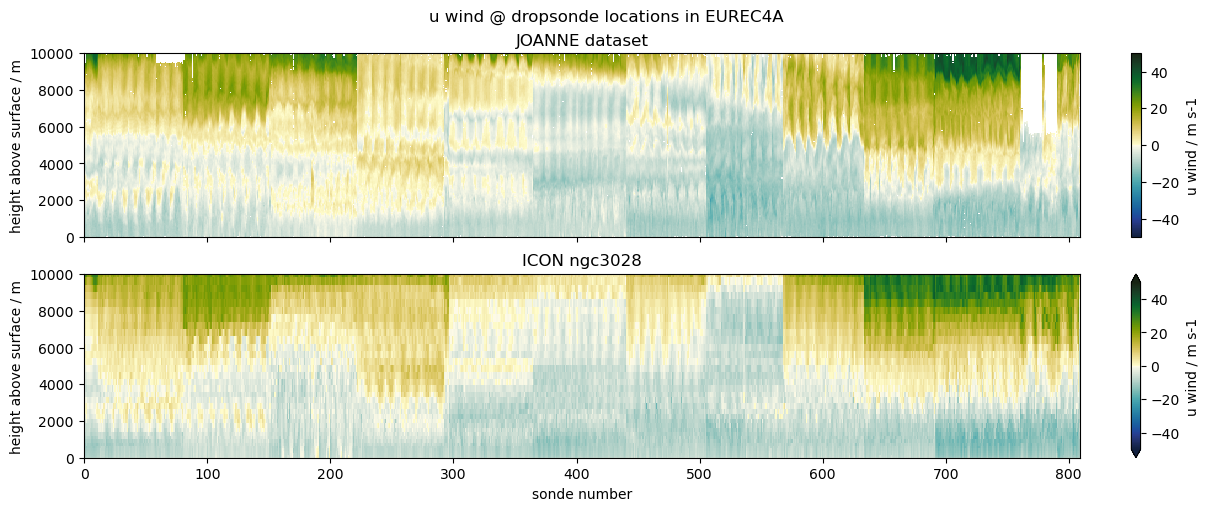
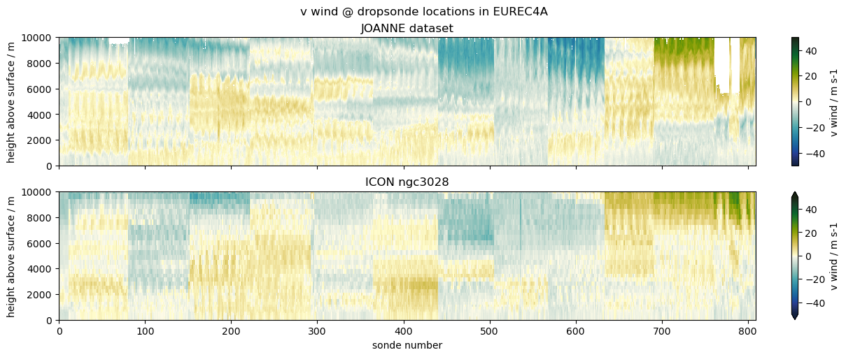
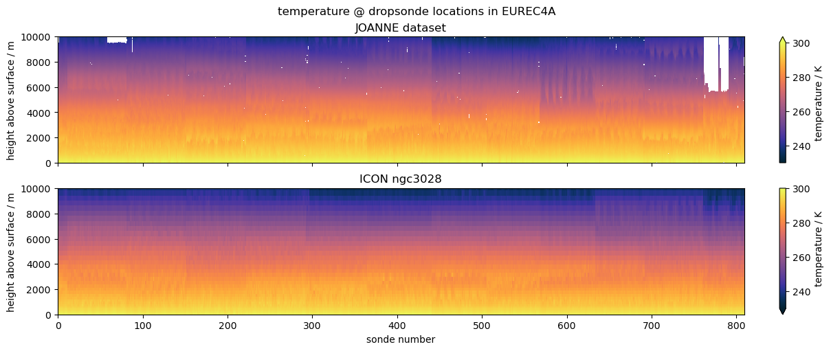
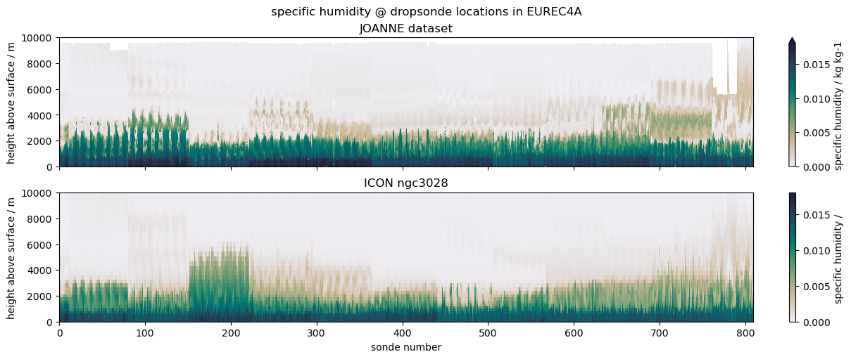
The example we choose is to compare data from dropsondes launched during the EUREC4A field campaign with profiles from the ICON ngc3028 model output. We don’t necessarily expect a good match, as the model is free running, but the campaign was close to the initialization date, so it’s interesting to look and serves the purpose of illustrating the use case.
import eurec4a
import intake
import healpy
import cmocean
import numpy as np
import matplotlib.pylab as plt
The EUREC4A field campaign also has an intake catalog. Have a look at HOWTO EUREC4A if you are interested in more data:
ecat = eurec4a.get_intake_catalog()
cat = intake.open_catalog("https://data.nextgems-h2020.eu/catalog.yaml")
The JOANNE Dataset contains dropsondes launched from multiple aircraft. But most were dropped from HALO, so for consistency we’ll just pick sondes from the:
joanne = ecat.dropsondes.JOANNE.level3.to_dask()
halo_sondes = [i.startswith("HALO") for i in joanne.sonde_id.values]
joanne = joanne.isel(sonde_id=halo_sondes)
To compare with the ICON output, we’ll fetch the highest resolution data…
icon = cat.ICON.ngc3028(zoom=10, time="PT3H").to_dask()
… figure out which pixels correspond to launch locations…
sonde_pix = healpy.ang2pix(
    icon.crs.healpix_nside, joanne.flight_lon, joanne.flight_lat, lonlat=True, nest=True
)
… and cut out the data we want to compare:
icon_sondes = (
    icon[["ua", "va", "ta", "hus"]]
    .sel(time=joanne.launch_time, method="nearest")
    .isel(cell=sonde_pix)
    .compute()
)
To make the plot a little nicer, we want a couple of variable-dependent settings:
settings = [
    ("u wind", "u", "ua", {"vmin": -50, "vmax": 50, "cmap": cmocean.cm.delta}),
    ("v wind", "v", "va", {"vmin": -50, "vmax": 50, "cmap": cmocean.cm.delta}),
    ("temperature", "ta", "ta", {"vmin": 230, "vmax": 300, "cmap": cmocean.cm.thermal}),
    (
        "specific humidity",
        "q",
        "hus",
        {"vmin": 0, "vmax": 0.018, "cmap": cmocean.cm.rain},
    ),
]
The default plot would use time on the x-axis, but as the dropsondes are not distributed equally in time, the plots wouldn’t be very informative. Instead the plan is to just enumerate the dropsondes on the x-axis. In order to easily do that, we’ll create an arbitrary n coordinate:
def lincoord(ds):
    return ds.assign_coords(n=(("sonde_id",), np.arange(ds.dims["sonde_id"])))
finally, we just have to loop over the plots and create them:
for title, vj, vi, s in settings:
    fig, (ax1, ax2) = plt.subplots(
        2,
        1,
        sharex=True,
        sharey=True,
        constrained_layout=True,
        facecolor="white",
        figsize=(12, 5),
    )
    joanne.pipe(lincoord)[vj].plot(
        ax=ax1,
        x="n",
        y="alt",
        **s,
        cbar_kwargs={"label": f"{title} / {joanne[vj].units}"},
    )
    icon_sondes.pipe(lincoord)[vi].plot(
        ax=ax2,
        x="n",
        y="zg",
        **s,
        cbar_kwargs={"label": f"{title} / {icon[vi].attrs.get('units', '')}"},
    )
    ax1.set_title("JOANNE dataset")
    ax2.set_title("ICON ngc3028")
    for ax in (ax1, ax2):
        ax.set_xlabel("sonde number")
        ax.set_ylabel("height above surface / m")
        ax.label_outer()
    plt.suptitle(f"{title} @ dropsonde locations in EUREC4A")
    plt.show()