Time space diagrams#
Different types of time-space diagrams are presented using traditional filled contoured, pcolormesh, and imshow. Examples are presented for two types of diagrams are created:
time latitude diagrams to illustrate the monsoon
time longitude diagram to illustrate interseasonal variability
For this we use some generic tools and functions that have been written for the nextGEMS data, especially to deal with the HEALPix formation.
import numpy as np
import matplotlib.pyplot as plt
import matplotlib.dates as mdates

import intake
Time-latitude (e.g., for monsoon)#
Setup and data sampling#
Coordinates and Regions#
For this analysis, it is convenient to have latitude and longitude coordinates attached to the dataset. We’ll use these coordinates both for selecting regions of interest as well as grouping the data for plotting. We use attach_coords from the easygems package for this task:
from easygems.healpix import attach_coords
Based on these coordinates, we can extract cell indices for desired regions. Note that you might also want to consider healpy pixel querying routines instead. Especially for high resolution data, it might be prohibitive to first create an array of all cell coordinates just to throw them away.
In this case, we first specify the domains conveniently as a function returning a boolean array of valid cells given a Dataset. In order not to repeat ourselves, we convert this boolean array to an index array using np.where in a separate function:
domains = {
    "atlantic": lambda ds: ds["lon"] > 300,
    "east pacific": lambda ds: (ds["lon"] > 210) & (ds["lon"] < 270.0),
    "maritime continent": lambda ds: (ds["lon"] > 110) & (ds["lon"] < 150.0),
    "indian ocean": lambda ds: (ds["lon"] > 60) & (ds["lon"] < 120.0),
    "global": lambda ds: True,
}


def cells_of_domain(ds, domain_name):
    return np.where(domains[domain_name](ds))[0]
Plot settings#
Scales and color maps are defined that will be used to define units for susquent plotting.
plot_properties = {
    "pr": {"vmin": 0.0, "vmax": 15.0 / (24 * 60 * 60), "cmap": "inferno"},
    "prw": {"vmin": 20.0, "vmax": 60.0, "cmap": "magma"},
}
Additional to these variable-dependent plot properties, we also want to customize the plot appearence.
To do this consistently for the upcoming plot examples, we’ll define a function which applies our customizations to a plot’s axis:
def format_axes_lat(ax):
    ax.set_ylabel("latitude / degN")

    ax.grid(True)
    ax.xaxis.set_major_locator(mdates.MonthLocator(bymonth=(1, 7)))
    ax.xaxis.set_minor_locator(mdates.MonthLocator())
    ax.xaxis.set_major_formatter(
        mdates.ConciseDateFormatter(ax.xaxis.get_major_locator())
    )
    ax.set_yscale(
        "function",
        functions=(
            lambda d: np.sin(np.deg2rad(d)),
            lambda d: np.rad2deg(np.arcsin(np.clip(d, -1, 1))),
        ),
    )
    ax.set_ylim(-90, 90)
    ax.set_yticks([-50, -30, -10, 0, 10, 30, 50])


def format_axes_lon(ax):
    ax.set_xticks(np.arange(7) * 60)
    ax.set_xlabel("longitude / degE")

    ax.yaxis.set_major_locator(mdates.MonthLocator())
    ax.yaxis.set_minor_locator(mdates.MonthLocator())
    ax.grid(True)
    ax.yaxis.set_major_formatter(
        mdates.ConciseDateFormatter(ax.yaxis.get_major_locator())
    )
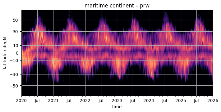
Obtaining the data#
cat = intake.open_catalog("https://data.nextgems-h2020.eu/online.yaml")
experiment = cat.ICON.ngc4008
ds = experiment(time="P1D", zoom=5).to_dask().pipe(attach_coords)
Here comes the time consuming step: we resample the daily data to aggregate over three day periods, and regroup it by latitude. Timing this step took 37s, for a zoom level 5 of daily data, using 1 core of a Levante compute node. The amount of time will also depend on the density of the original data. Below we actually evaluate the data so that the subsequent plotting functions don’t need to do the time-intensive again and again.
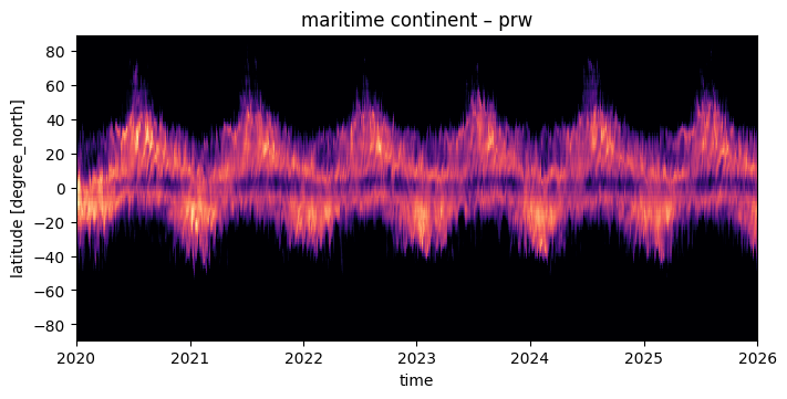
var = "prw"
domain = "maritime continent"

da = (
    ds[var]
    .sel(time=slice("2020", "2025"))
    .isel(cell=cells_of_domain(ds, domain))
    .resample(time="3D")
    .mean(dim="time")
    .groupby("lat")
    .mean()
).compute()
Plotting the data#
In the examples below we plot the data using different approaches.
use a simple pcolormesh plot which should be self explanatory.
use a filled contour plot which some people might know from the good old days.
use imshow and explain why it may be problematic in this case.
Previously a datashader scatter plot has been used at this place as well. This has been removed as the data is already available in a dense rectangular grid with less data points than pixels. In this case pcolormesh will do just as good, but is much simpler to do correctly.
pcolormesh#
The using pcolormesh is xarray’s default for 2D data. We’ll just use it for simplicity:
fig, ax = plt.subplots(figsize=(7, 3.5), constrained_layout=True)
da.plot(x="time", ax=ax, **plot_properties[var], add_colorbar=False)
ax.set_title(f"{domain} – {var}")
format_axes_lat(ax)
contourf#
Some people like the broken shading of countourf. It’s easy to use as well, if it’s worth typing a few additional letters is up to the reader.
fig, ax = plt.subplots(figsize=(7, 3.5), constrained_layout=True)
da.plot.contourf(x="time", ax=ax, **plot_properties[var], add_colorbar=False)
ax.set_title(f"{domain} – {var}")
format_axes_lat(ax)
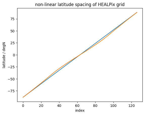
imshow#
imshow tends to be faster than either of the above, however it assumes linear spacing of the data in the array, which doesn’t apply to our case. Not only do we use a sin-scale for latitudes to better represent their share of global area, but also the HEALPix grid doesn’t have equal spacing of latitude rings:
index = np.arange(0, len(da.lat))
lats_linspaced = np.linspace(da.lat.min().values, da.lat.max().values, da.lat.size)
fig, ax = plt.subplots()
plt.plot(index, lats_linspaced, label="linear")
plt.plot(index, da.lat, label="HEALPix")
plt.xlabel("index")
plt.ylabel("latitude / degN")
plt.title("non-linear latitude spacing of HEALPix grid");
If we were to ignore this fact (or assume the deviation is small), we could just do a quick plot as follows.
On the machine where this notebook was developed, the difference between pcolormesh and imshow is 40 ms vs 25 ms. A noticable difference, but maybe not worth the extra trouble.
y-scale
We intentionally don’t call format_axes_lat, because the sin-scale would not change the picture but make the scale even worse (the sin-scale would not be applied to the data, only to the scale).
fig, ax = plt.subplots(figsize=(7, 3.5), constrained_layout=True)
da.plot.imshow(x="time", ax=ax, **plot_properties[var], add_colorbar=False)
ax.set_title(f"{domain} – {var}");
# format_axes_lat(ax)
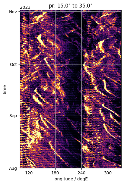
Longitude-time (e.g., for interseasonal)#
HEALPix data is aligned along lines of longitude only in the tropics. This means, the simple groupby approach works only in those regions. Outside that range one might want to use groupby_bins.
ds = experiment(time="PT3H", zoom=5).to_dask().pipe(attach_coords)
var_lon = "pr"
Slim, Nlim = 15.0, 35.0

da_by_lon = (
    ds[var_lon]
    .sel(time=slice("2023-08-01", "2023-11-01"))
    .where((ds["lat"] > Slim) & (ds["lat"] < Nlim), drop=True)
    .groupby("lon")
    .mean()
).compute()
fig, ax = plt.subplots(figsize=(4, 6), constrained_layout=True)
da_by_lon.plot(y="time", ax=ax, **plot_properties[var_lon], add_colorbar=False)
ax.set_title(rf"{var_lon}: {Slim}$^{{\circ}}$ to {Nlim}$^{{\circ}}$")
format_axes_lon(ax)
ax.set_xlim(100.0, 330.0)
(100.0, 330.0)