
Subsampling and Averaging#
Due to the ordering of grid indices in global ICON grids, it is possible to quickly subsample and average datasets spatially.
import intake
import numpy as np
import xarray as xr
import yaml
from gridlocator import merge_grid
getting some data#
We’ll first grab some datasets as usual. Here we use the prw variable from an ICON R02B09 run.
col_url = "/pf/k/k202134/DYAMOND/Processing/full_catalog.json"
col = intake.open_esm_datastore(col_url)
res = col.search(
    variable="prw",
    project="NextGEMS",
    model="ICON-SAP-5km",
    ensemble_member="dpp0052",
    operation="inst",
)
d = res.to_dataset_dict(cdf_kwargs={"chunks": {"time": 1}})
--> The keys in the returned dictionary of datasets are constructed as follows:
	'project.institute.model.experiment.domain.frequency.grid.level_type.ensemble_member.operation'
We also need the grid information for plotting, so we’ll use a little helper function from gridlocator.py in this directory.
ds = merge_grid(next(iter(d.values())))
ds
<xarray.Dataset>
Dimensions:                         (time: 1969, cell: 20971520, nv: 3, vertex: 10485762, ne: 6, edge: 31457280, no: 4, nc: 2, max_stored_decompositions: 4, two_grf: 2, cell_grf: 14, max_chdom: 1, edge_grf: 24, vert_grf: 13)
Coordinates:
  * time                            (time) float64 2.02e+07 ... 2.02e+07
    clon                            (cell) float64 ...
    clat                            (cell) float64 ...
    vlon                            (vertex) float64 ...
    vlat                            (vertex) float64 ...
    elon                            (edge) float64 ...
    elat                            (edge) float64 ...
Dimensions without coordinates: cell, nv, vertex, ne, edge, no, nc, max_stored_decompositions, two_grf, cell_grf, max_chdom, edge_grf, vert_grf
Data variables: (12/92)
    prw                             (time, cell) float32 dask.array<chunksize=(1, 20971520), meta=np.ndarray>
    clon_vertices                   (cell, nv) float64 ...
    clat_vertices                   (cell, nv) float64 ...
    vlon_vertices                   (vertex, ne) float64 ...
    vlat_vertices                   (vertex, ne) float64 ...
    elon_vertices                   (edge, no) float64 ...
    ...                              ...
    edge_dual_normal_cartesian_x    (edge) float64 ...
    edge_dual_normal_cartesian_y    (edge) float64 ...
    edge_dual_normal_cartesian_z    (edge) float64 ...
    cell_circumcenter_cartesian_x   (cell) float64 ...
    cell_circumcenter_cartesian_y   (cell) float64 ...
    cell_circumcenter_cartesian_z   (cell) float64 ...
Attributes:
    references:              see MPIM/DWD publications
    title:                   ICON simulation
    CDI:                     Climate Data Interface version 1.8.3rc (http://m...
    history:                 /work/mh0287/k203123/GIT/icon-aes-dyw3/bin/icon ...
    source:                  git@gitlab.dkrz.de:icon/icon-aes.git@83f3dcef81e...
    institution:             Max Planck Institute for Meteorology/Deutscher W...
    Conventions:             CF-1.6
    intake_esm_varname:      ['prw']
    number_of_grid_used:     15
    grid_file_uri:           http://icon-downloads.mpimet.mpg.de/grids/public...
    uuidOfHGrid:             0f1e7d66-637e-11e8-913b-51232bb4d8f9
intake_esm_dataset_key: NextGEMS.MPIM-DWD-DKRZ.ICON-SAP-5km.Cycle1.atm.3...- time: 1969
- cell: 20971520
- nv: 3
- vertex: 10485762
- ne: 6
- edge: 31457280
- no: 4
- nc: 2
- max_stored_decompositions: 4
- two_grf: 2
- cell_grf: 14
- max_chdom: 1
- edge_grf: 24
- vert_grf: 13
- time(time)float642.02e+07 2.02e+07 ... 2.02e+07
- standard_name :
- time
- units :
- day as %Y%m%d.%f
- calendar :
- proleptic_gregorian
- axis :
- T
array([20200120. , 20200120.020833, 20200120.041667, ..., 20200229.958333, 20200229.979167, 20200301. ]) - clon(cell)float64...
- long_name :
- center longitude
- units :
- radian
- standard_name :
- grid_longitude
- bounds :
- clon_vertices
[20971520 values with dtype=float64]
- clat(cell)float64...
- long_name :
- center latitude
- units :
- radian
- standard_name :
- grid_latitude
- bounds :
- clat_vertices
[20971520 values with dtype=float64]
- vlon(vertex)float64...
- long_name :
- vertex longitude
- units :
- radian
- standard_name :
- grid_longitude
- bounds :
- vlon_vertices
[10485762 values with dtype=float64]
- vlat(vertex)float64...
- long_name :
- vertex latitude
- units :
- radian
- standard_name :
- grid_latitude
- bounds :
- vlat_vertices
[10485762 values with dtype=float64]
- elon(edge)float64...
- long_name :
- edge midpoint longitude
- units :
- radian
- standard_name :
- grid_longitude
- bounds :
- elon_vertices
[31457280 values with dtype=float64]
- elat(edge)float64...
- long_name :
- edge midpoint latitude
- units :
- radian
- standard_name :
- grid_latitude
- bounds :
- elat_vertices
[31457280 values with dtype=float64]
- prw(time, cell)float32dask.array<chunksize=(1, 20971520), meta=np.ndarray>
- standard_name :
- total_vapour
- long_name :
- vertically integrated water vapour
- units :
- kg m-2
- param :
- 64.1.0
- CDI_grid_type :
- unstructured
- number_of_grid_in_reference :
- 1
- level_type :
- atmosphere
Array Chunk Bytes 165.17 GB 83.89 MB Shape (1969, 20971520) (1, 20971520) Count 3980 Tasks 1969 Chunks Type float32 numpy.ndarray - clon_vertices(cell, nv)float64...
- units :
- radian
[62914560 values with dtype=float64]
- clat_vertices(cell, nv)float64...
- units :
- radian
[62914560 values with dtype=float64]
- vlon_vertices(vertex, ne)float64...
- units :
- radian
[62914572 values with dtype=float64]
- vlat_vertices(vertex, ne)float64...
- units :
- radian
[62914572 values with dtype=float64]
- elon_vertices(edge, no)float64...
- units :
- radian
[125829120 values with dtype=float64]
- elat_vertices(edge, no)float64...
- units :
- radian
[125829120 values with dtype=float64]
- ifs2icon_cell_grid(cell)float64...
- long_name :
- ifs to icon cells
[20971520 values with dtype=float64]
- ifs2icon_edge_grid(edge)float64...
- long_name :
- ifs to icon edge
[31457280 values with dtype=float64]
- ifs2icon_vertex_grid(vertex)float64...
- long_name :
- ifs to icon vertex
[10485762 values with dtype=float64]
- cell_area(cell)float64...
- long_name :
- area of grid cell
- units :
- m2
- standard_name :
- area
- grid_type :
- unstructured
- number_of_grid_in_reference :
- 1
[20971520 values with dtype=float64]
- dual_area(vertex)float64...
- long_name :
- areas of dual hexagonal/pentagonal cells
- units :
- m2
- standard_name :
- area
[10485762 values with dtype=float64]
- phys_cell_id(cell)int32...
- long_name :
- physical domain ID of cell
- grid_type :
- unstructured
- number_of_grid_in_reference :
- 1
[20971520 values with dtype=int32]
- phys_edge_id(edge)int32...
- long_name :
- physical domain ID of edge
[31457280 values with dtype=int32]
- lon_cell_centre(cell)float64...
- long_name :
- longitude of cell centre
- units :
- radian
- grid_type :
- unstructured
- number_of_grid_in_reference :
- 1
[20971520 values with dtype=float64]
- lat_cell_centre(cell)float64...
- long_name :
- latitude of cell centre
- units :
- radian
- grid_type :
- unstructured
- number_of_grid_in_reference :
- 1
[20971520 values with dtype=float64]
- lat_cell_barycenter(cell)float64...
- long_name :
- latitude of cell barycenter
- units :
- radian
- grid_type :
- unstructured
- number_of_grid_in_reference :
- 1
[20971520 values with dtype=float64]
- lon_cell_barycenter(cell)float64...
- long_name :
- longitude of cell barycenter
- units :
- radian
- grid_type :
- unstructured
- number_of_grid_in_reference :
- 1
[20971520 values with dtype=float64]
- longitude_vertices(vertex)float64...
- long_name :
- longitude of vertices
- units :
- radian
[10485762 values with dtype=float64]
- latitude_vertices(vertex)float64...
- long_name :
- latitude of vertices
- units :
- radian
[10485762 values with dtype=float64]
- lon_edge_centre(edge)float64...
- long_name :
- longitudes of edge midpoints
- units :
- radian
[31457280 values with dtype=float64]
- lat_edge_centre(edge)float64...
- long_name :
- latitudes of edge midpoints
- units :
- radian
[31457280 values with dtype=float64]
- edge_of_cell(nv, cell)int32...
- long_name :
- edges of each cellvertices
[62914560 values with dtype=int32]
- vertex_of_cell(nv, cell)int32...
- long_name :
- vertices of each cellcells ad
[62914560 values with dtype=int32]
- adjacent_cell_of_edge(nc, edge)int32...
- long_name :
- cells adjacent to each edge
[62914560 values with dtype=int32]
- edge_vertices(nc, edge)int32...
- long_name :
- vertices at the end of of each edge
[62914560 values with dtype=int32]
- cells_of_vertex(ne, vertex)int32...
- long_name :
- cells around each vertex
[62914572 values with dtype=int32]
- edges_of_vertex(ne, vertex)int32...
- long_name :
- edges around each vertex
[62914572 values with dtype=int32]
- vertices_of_vertex(ne, vertex)int32...
- long_name :
- vertices around each vertex
[62914572 values with dtype=int32]
- cell_area_p(cell)float64...
- long_name :
- area of grid cell
- units :
- m2
- grid_type :
- unstructured
- number_of_grid_in_reference :
- 1
[20971520 values with dtype=float64]
- cell_elevation(cell)float64...
- long_name :
- elevation at the cell centers
- units :
- m
- grid_type :
- unstructured
- number_of_grid_in_reference :
- 1
[20971520 values with dtype=float64]
- cell_sea_land_mask(cell)int32...
- long_name :
- sea (-2 inner, -1 boundary) land (2 inner, 1 boundary) mask for the cell
- units :
- 2,1,-1,-
- grid_type :
- unstructured
- number_of_grid_in_reference :
- 1
[20971520 values with dtype=int32]
- cell_domain_id(cell, max_stored_decompositions)int32...
- long_name :
- cell domain id for decomposition
[83886080 values with dtype=int32]
- cell_no_of_domains(max_stored_decompositions)int32...
- long_name :
- number of domains for each decomposition
array([0, 0, 0, 0], dtype=int32)
- dual_area_p(vertex)float64...
- long_name :
- areas of dual hexagonal/pentagonal cells
- units :
- m2
[10485762 values with dtype=float64]
- edge_length(edge)float64...
- long_name :
- lengths of edges of triangular cells
- units :
- m
[31457280 values with dtype=float64]
- edge_cell_distance(nc, edge)float64...
- long_name :
- distances between edge midpoint and adjacent triangle midpoints
- units :
- m
[62914560 values with dtype=float64]
- dual_edge_length(edge)float64...
- long_name :
- lengths of dual edges (distances between triangular cell circumcenters)
- units :
- m
[31457280 values with dtype=float64]
- edgequad_area(edge)float64...
- long_name :
- area around the edge formed by the two adjacent triangles
- units :
- m2
[31457280 values with dtype=float64]
- edge_elevation(edge)float64...
- long_name :
- elevation at the edge centers
- units :
- m
[31457280 values with dtype=float64]
- edge_sea_land_mask(edge)int32...
- long_name :
- sea (-2 inner, -1 boundary) land (2 inner, 1 boundary) mask for the cell
- units :
- 2,1,-1,-
[31457280 values with dtype=int32]
- edge_vert_distance(nc, edge)float64...
- long_name :
- distances between edge midpoint and vertices of that edge
- units :
- m
[62914560 values with dtype=float64]
- zonal_normal_primal_edge(edge)float64...
- long_name :
- zonal component of normal to primal edge
- units :
- radian
[31457280 values with dtype=float64]
- meridional_normal_primal_edge(edge)float64...
- long_name :
- meridional component of normal to primal edge
- units :
- radian
[31457280 values with dtype=float64]
- zonal_normal_dual_edge(edge)float64...
- long_name :
- zonal component of normal to dual edge
- units :
- radian
[31457280 values with dtype=float64]
- meridional_normal_dual_edge(edge)float64...
- long_name :
- meridional component of normal to dual edge
- units :
- radian
[31457280 values with dtype=float64]
- orientation_of_normal(nv, cell)int32...
- long_name :
- orientations of normals to triangular cell edges
[62914560 values with dtype=int32]
- cell_index(cell)int32...
- long_name :
- cell index
[20971520 values with dtype=int32]
- parent_cell_index(cell)int32...
- long_name :
- parent cell index
[20971520 values with dtype=int32]
- parent_cell_type(cell)int32...
- long_name :
- parent cell type
[20971520 values with dtype=int32]
- neighbor_cell_index(nv, cell)int32...
- long_name :
- cell neighbor index
[62914560 values with dtype=int32]
- child_cell_index(no, cell)int32...
- long_name :
- child cell index
[83886080 values with dtype=int32]
- child_cell_id(cell)int32...
- long_name :
- domain ID of child cell
[20971520 values with dtype=int32]
- edge_index(edge)int32...
- long_name :
- edge index
[31457280 values with dtype=int32]
- edge_parent_type(edge)int32...
- long_name :
- edge paren
[31457280 values with dtype=int32]
- vertex_index(vertex)int32...
- long_name :
- vertices index
[10485762 values with dtype=int32]
- edge_orientation(ne, vertex)int32...
- long_name :
- edge orientation
[62914572 values with dtype=int32]
- edge_system_orientation(edge)int32...
- long_name :
- edge system orientation
[31457280 values with dtype=int32]
- refin_c_ctrl(cell)int32...
- long_name :
- refinement control flag for cells
[20971520 values with dtype=int32]
- index_c_list(two_grf, cell_grf)int32...
- long_name :
- list of start and end indices for each refinement control level for cells
array([[-2147483647, -2147483647, -2147483647, -2147483647, -2147483647, -2147483647, -2147483647, -2147483647, -2147483647, -2147483647, -2147483647, -2147483647, -2147483647, -2147483647], [-2147483647, -2147483647, -2147483647, -2147483647, -2147483647, -2147483647, -2147483647, -2147483647, -2147483647, -2147483647, -2147483647, -2147483647, -2147483647, -2147483647]], dtype=int32) - start_idx_c(max_chdom, cell_grf)int32...
- long_name :
- list of start indices for each refinement control level for cells
array([[20971521, 20971521, 20971521, 20971521, 20971521, 20971521, 20971521, 20971521, 20971521, 1, 1, 1, 1, 1]], dtype=int32) - end_idx_c(max_chdom, cell_grf)int32...
- long_name :
- list of end indices for each refinement control level for cells
array([[20971520, 20971520, 20971520, 20971520, 20971520, 20971520, 20971520, 20971520, 20971520, 0, 0, 0, 0, 0]], dtype=int32) - refin_e_ctrl(edge)int32...
- long_name :
- refinement control flag for edges
[31457280 values with dtype=int32]
- index_e_list(two_grf, edge_grf)int32...
- long_name :
- list of start and end indices for each refinement control level for edges
array([[-2147483647, -2147483647, -2147483647, -2147483647, -2147483647, -2147483647, -2147483647, -2147483647, -2147483647, -2147483647, -2147483647, -2147483647, -2147483647, -2147483647, -2147483647, -2147483647, -2147483647, -2147483647, -2147483647, -2147483647, -2147483647, -2147483647, -2147483647, -2147483647], [-2147483647, -2147483647, -2147483647, -2147483647, -2147483647, -2147483647, -2147483647, -2147483647, -2147483647, -2147483647, -2147483647, -2147483647, -2147483647, -2147483647, -2147483647, -2147483647, -2147483647, -2147483647, -2147483647, -2147483647, -2147483647, -2147483647, -2147483647, -2147483647]], dtype=int32) - start_idx_e(max_chdom, edge_grf)int32...
- long_name :
- list of start indices for each refinement control level for edges
array([[31457281, 31457281, 31457281, 31457281, 31457281, 31457281, 31457281, 31457281, 31457281, 31457281, 31457281, 31457281, 31457281, 31457281, 1, 1, 1, 1, 1, 1, 1, 1, 1, 1]], dtype=int32) - end_idx_e(max_chdom, edge_grf)int32...
- long_name :
- list of end indices for each refinement control level for edges
array([[31457280, 31457280, 31457280, 31457280, 31457280, 31457280, 31457280, 31457280, 31457280, 31457280, 31457280, 31457280, 31457280, 31457280, 0, 0, 0, 0, 0, 0, 0, 0, 0, 0]], dtype=int32) - refin_v_ctrl(vertex)int32...
- long_name :
- refinement control flag for vertices
[10485762 values with dtype=int32]
- index_v_list(two_grf, vert_grf)int32...
- long_name :
- list of start and end indices for each refinement control level for vertices
array([[-2147483647, -2147483647, -2147483647, -2147483647, -2147483647, -2147483647, -2147483647, -2147483647, -2147483647, -2147483647, -2147483647, -2147483647, -2147483647], [-2147483647, -2147483647, -2147483647, -2147483647, -2147483647, -2147483647, -2147483647, -2147483647, -2147483647, -2147483647, -2147483647, -2147483647, -2147483647]], dtype=int32) - start_idx_v(max_chdom, vert_grf)int32...
- long_name :
- list of start indices for each refinement control level for vertices
array([[10485763, 10485763, 10485763, 10485763, 10485763, 10485763, 10485763, 10485763, 1, 1, 1, 1, 1]], dtype=int32) - end_idx_v(max_chdom, vert_grf)int32...
- long_name :
- list of end indices for each refinement control level for vertices
array([[10485762, 10485762, 10485762, 10485762, 10485762, 10485762, 10485762, 10485762, 0, 0, 0, 0, 0]], dtype=int32) - parent_edge_index(edge)int32...
- long_name :
- parent edge index
[31457280 values with dtype=int32]
- child_edge_index(no, edge)int32...
- long_name :
- child edge index
[125829120 values with dtype=int32]
- child_edge_id(edge)int32...
- long_name :
- domain ID of child edge
[31457280 values with dtype=int32]
- parent_vertex_index(vertex)int32...
- long_name :
- parent vertex index
[10485762 values with dtype=int32]
- cartesian_x_vertices(vertex)float64...
- long_name :
- vertex cartesian coordinate x on unit sp
- units :
- meters
[10485762 values with dtype=float64]
- cartesian_y_vertices(vertex)float64...
- long_name :
- vertex cartesian coordinate y on unit sp
- units :
- meters
[10485762 values with dtype=float64]
- cartesian_z_vertices(vertex)float64...
- long_name :
- vertex cartesian coordinate z on unit sp
- units :
- meters
[10485762 values with dtype=float64]
- edge_middle_cartesian_x(edge)float64...
- long_name :
- prime edge center cartesian coordinate x on unit sphere
- units :
- meters
[31457280 values with dtype=float64]
- edge_middle_cartesian_y(edge)float64...
- long_name :
- prime edge center cartesian coordinate y on unit sphere
- units :
- meters
[31457280 values with dtype=float64]
- edge_middle_cartesian_z(edge)float64...
- long_name :
- prime edge center cartesian coordinate z on unit sphere
- units :
- meters
[31457280 values with dtype=float64]
- edge_dual_middle_cartesian_x(edge)float64...
- long_name :
- dual edge center cartesian coordinate x on unit sphere
- units :
- meters
[31457280 values with dtype=float64]
- edge_dual_middle_cartesian_y(edge)float64...
- long_name :
- dual edge center cartesian coordinate y on unit sphere
- units :
- meters
[31457280 values with dtype=float64]
- edge_dual_middle_cartesian_z(edge)float64...
- long_name :
- dual edge center cartesian coordinate z on unit sphere
- units :
- meters
[31457280 values with dtype=float64]
- edge_primal_normal_cartesian_x(edge)float64...
- long_name :
- unit normal to the prime edge 3D vector, coordinate x
- units :
- meters
[31457280 values with dtype=float64]
- edge_primal_normal_cartesian_y(edge)float64...
- long_name :
- unit normal to the prime edge 3D vector, coordinate y
- units :
- meters
[31457280 values with dtype=float64]
- edge_primal_normal_cartesian_z(edge)float64...
- long_name :
- unit normal to the prime edge 3D vector, coordinate z
- units :
- meters
[31457280 values with dtype=float64]
- edge_dual_normal_cartesian_x(edge)float64...
- long_name :
- unit normal to the dual edge 3D vector, coordinate x
- units :
- meters
[31457280 values with dtype=float64]
- edge_dual_normal_cartesian_y(edge)float64...
- long_name :
- unit normal to the dual edge 3D vector, coordinate y
- units :
- meters
[31457280 values with dtype=float64]
- edge_dual_normal_cartesian_z(edge)float64...
- long_name :
- unit normal to the dual edge 3D vector, coordinate z
- units :
- meters
[31457280 values with dtype=float64]
- cell_circumcenter_cartesian_x(cell)float64...
- long_name :
- cartesian position of the prime cell circumcenter on the unit sphere, coordinate x
- units :
- meters
[20971520 values with dtype=float64]
- cell_circumcenter_cartesian_y(cell)float64...
- long_name :
- cartesian position of the prime cell circumcenter on the unit sphere, coordinate y
- units :
- meters
[20971520 values with dtype=float64]
- cell_circumcenter_cartesian_z(cell)float64...
- long_name :
- cartesian position of the prime cell circumcenter on the unit sphere, coordinate z
- units :
- meters
[20971520 values with dtype=float64]
- references :
- see MPIM/DWD publications
- title :
- ICON simulation
- CDI :
- Climate Data Interface version 1.8.3rc (http://mpimet.mpg.de/cdi)
- history :
- /work/mh0287/k203123/GIT/icon-aes-dyw3/bin/icon at 20210925 101846 /work/mh0287/k203123/GIT/icon-aes-dyw3/bin/icon at 20210927 141015 /work/mh0287/k203123/GIT/icon-aes-dyw3/bin/icon at 20210927 141015 /work/mh0287/k203123/GIT/icon-aes-dyw3/bin/icon at 20210927 141015 /work/mh0287/k203123/GIT/icon-aes-dyw3/bin/icon at 20210927 141015 /work/mh0287/k203123/GIT/icon-aes-dyw3/bin/icon at 20210927 141015 /work/mh0287/k203123/GIT/icon-aes-dyw3/bin/icon at 20210927 210555 /work/mh0287/k203123/GIT/icon-aes-dyw3/bin/icon at 20210927 210555 /work/mh0287/k203123/GIT/icon-aes-dyw3/bin/icon at 20210927 210555 /work/mh0287/k203123/GIT/icon-aes-dyw3/bin/icon at 20210927 210555 /work/mh0287/k203123/GIT/icon-aes-dyw3/bin/icon at 20210927 210555 /work/mh0287/k203123/GIT/icon-aes-dyw3/bin/icon at 20210928 035903 /work/mh0287/k203123/GIT/icon-aes-dyw3/bin/icon at 20210928 035903 /work/mh0287/k203123/GIT/icon-aes-dyw3/bin/icon at 20210928 035903 /work/mh0287/k203123/GIT/icon-aes-dyw3/bin/icon at 20210928 035903 /work/mh0287/k203123/GIT/icon-aes-dyw3/bin/icon at 20210928 035903 /work/mh0287/k203123/GIT/icon-aes-dyw3/bin/icon at 20210928 104525 /work/mh0287/k203123/GIT/icon-aes-dyw3/bin/icon at 20210928 104525 /work/mh0287/k203123/GIT/icon-aes-dyw3/bin/icon at 20210928 104525 /work/mh0287/k203123/GIT/icon-aes-dyw3/bin/icon at 20210928 104525 /work/mh0287/k203123/GIT/icon-aes-dyw3/bin/icon at 20210928 104525 /work/mh0287/k203123/GIT/icon-aes-dyw3/bin/icon at 20210928 173436 /work/mh0287/k203123/GIT/icon-aes-dyw3/bin/icon at 20210928 173436 /work/mh0287/k203123/GIT/icon-aes-dyw3/bin/icon at 20210928 173436 /work/mh0287/k203123/GIT/icon-aes-dyw3/bin/icon at 20210928 173436 /work/mh0287/k203123/GIT/icon-aes-dyw3/bin/icon at 20210928 173436 /work/mh0287/k203123/GIT/icon-aes-dyw3/bin/icon at 20210929 010322 /work/mh0287/k203123/GIT/icon-aes-dyw3/bin/icon at 20210929 010322 /work/mh0287/k203123/GIT/icon-aes-dyw3/bin/icon at 20210929 010322 /work/mh0287/k203123/GIT/icon-aes-dyw3/bin/icon at 20210929 010322 /work/mh0287/k203123/GIT/icon-aes-dyw3/bin/icon at 20210929 010322 /work/mh0287/k203123/GIT/icon-aes-dyw3/bin/icon at 20210929 075522 /work/mh0287/k203123/GIT/icon-aes-dyw3/bin/icon at 20210929 075522 /work/mh0287/k203123/GIT/icon-aes-dyw3/bin/icon at 20210929 075522 /work/mh0287/k203123/GIT/icon-aes-dyw3/bin/icon at 20210929 075522 /work/mh0287/k203123/GIT/icon-aes-dyw3/bin/icon at 20210929 075522 /work/mh0287/k203123/GIT/icon-aes-dyw3/bin/icon at 20210929 175342
- source :
- git@gitlab.dkrz.de:icon/icon-aes.git@83f3dcef81e1f6c1ea3639adadea72874288625a
- institution :
- Max Planck Institute for Meteorology/Deutscher Wetterdienst
- Conventions :
- CF-1.6
- intake_esm_varname :
- ['prw']
- number_of_grid_used :
- 15
- grid_file_uri :
- http://icon-downloads.mpimet.mpg.de/grids/public/mpim/0015/icon_grid_0015_R02B09_G.nc
- uuidOfHGrid :
- 0f1e7d66-637e-11e8-913b-51232bb4d8f9
- intake_esm_dataset_key :
- NextGEMS.MPIM-DWD-DKRZ.ICON-SAP-5km.Cycle1.atm.30min.gn.2d.dpp0052.inst
Scatter-plotting with coarse resolution#
%matplotlib inline
import matplotlib.pylab as plt
Plotting the entire globe in a small window can take very long for little benefit as there are many more grid cells than pixles available. Thus we need to combine sevaral grid cells into each pixel anyways. If we combine adjacent triangles before plotting, we still get a nice image at a fraction of the time. Please have a look at the chapter on grid index odering if you like to know more about why the following works. In short: every \(4^n\) adjacent grid cells are spatially close to each other, so we can combine those in a meaningful way.
In this example, we’ll look at two methods: averaging and subsampling.
In the first case, we use reshape to convert the 1D data array into a 2D array where the 0-th axis will be the cell index at a coarser resolution and the 1-st axis will be the “details” within the coarse cell. We can use that representation to average (mean) across the details.
The second case just selects every \(4^n\)-th element which happens to be the central cell of each coarse cell.
Let’s first arrange some variables and then do the plotting:
coarsen = 4
a = ds.prw.isel(time=100).values
vmin = 0
vmax = a.max()
fig, (ax1, ax2) = plt.subplots(1, 2, figsize=(14, 7), dpi=300)
ax1.scatter(
    ds.clon[:: 4**coarsen],
    ds.clat[:: 4**coarsen],
    c=a.reshape(-1, 4**coarsen).mean(axis=-1),
    s=1,
)
ax2.scatter(
    ds.clon[:: 4**coarsen], ds.clat[:: 4**coarsen], c=a[:: 4**coarsen], s=1
)
ax1.set_title("var.reshape(-1, 4**n).mean(axis=-1)")
ax2.set_title("var[::4**n]")

for ax in (ax1, ax2):
    ax.axis("off")
    ax.set_xlim(-np.pi, np.pi)
    ax.set_ylim(-np.pi * 0.45, np.pi * 0.45)
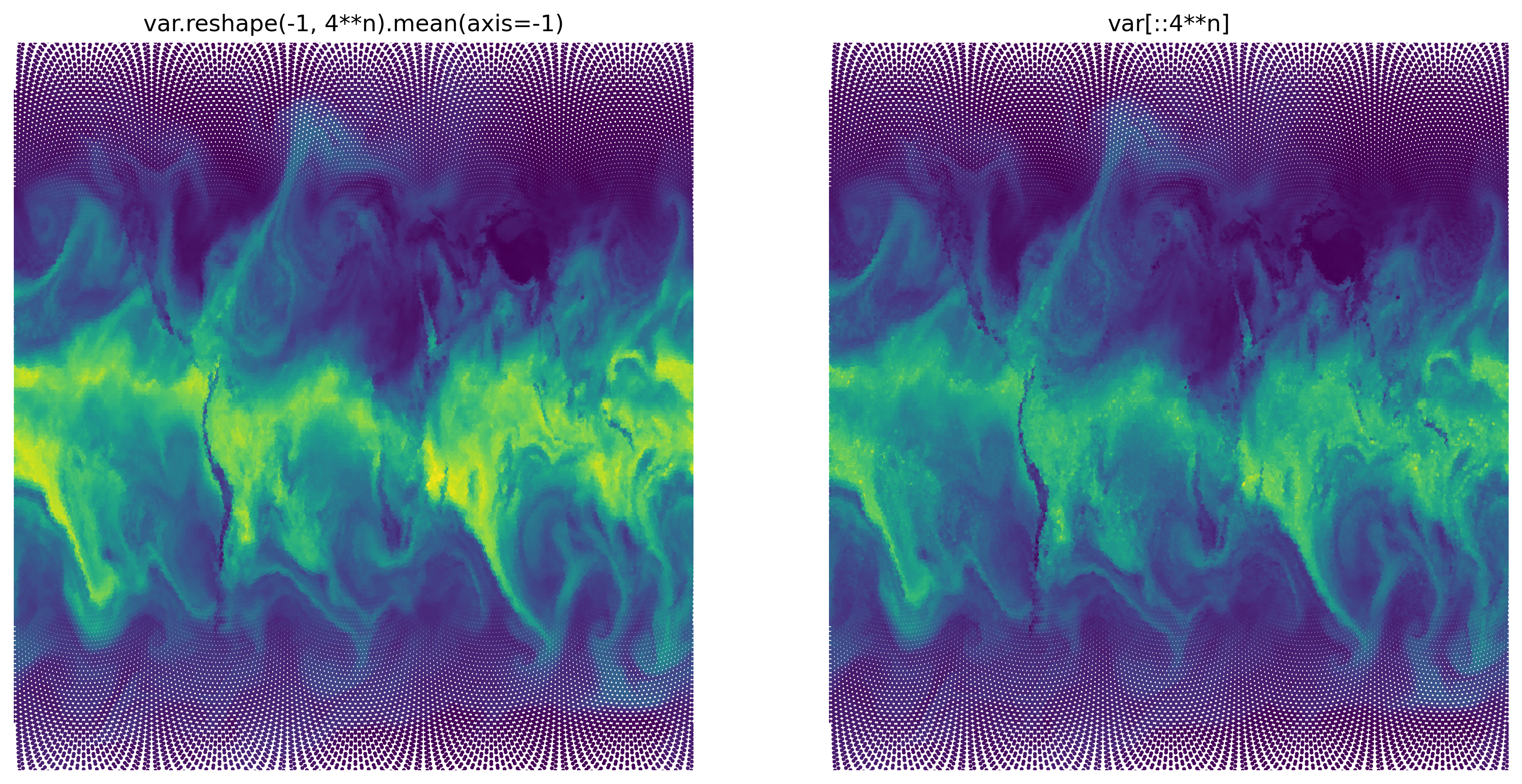
This works reasonably fast and creates a reasonable view of the globe. But it also creates a (quite nice) pattern of dots around the poles. This reminds us of the map projection which distorts the (roughly) equally spaced cell centers on the globe to an unequal spacing in 2d space. To create a slightly better version of the plot, we’ll look at another little trick:
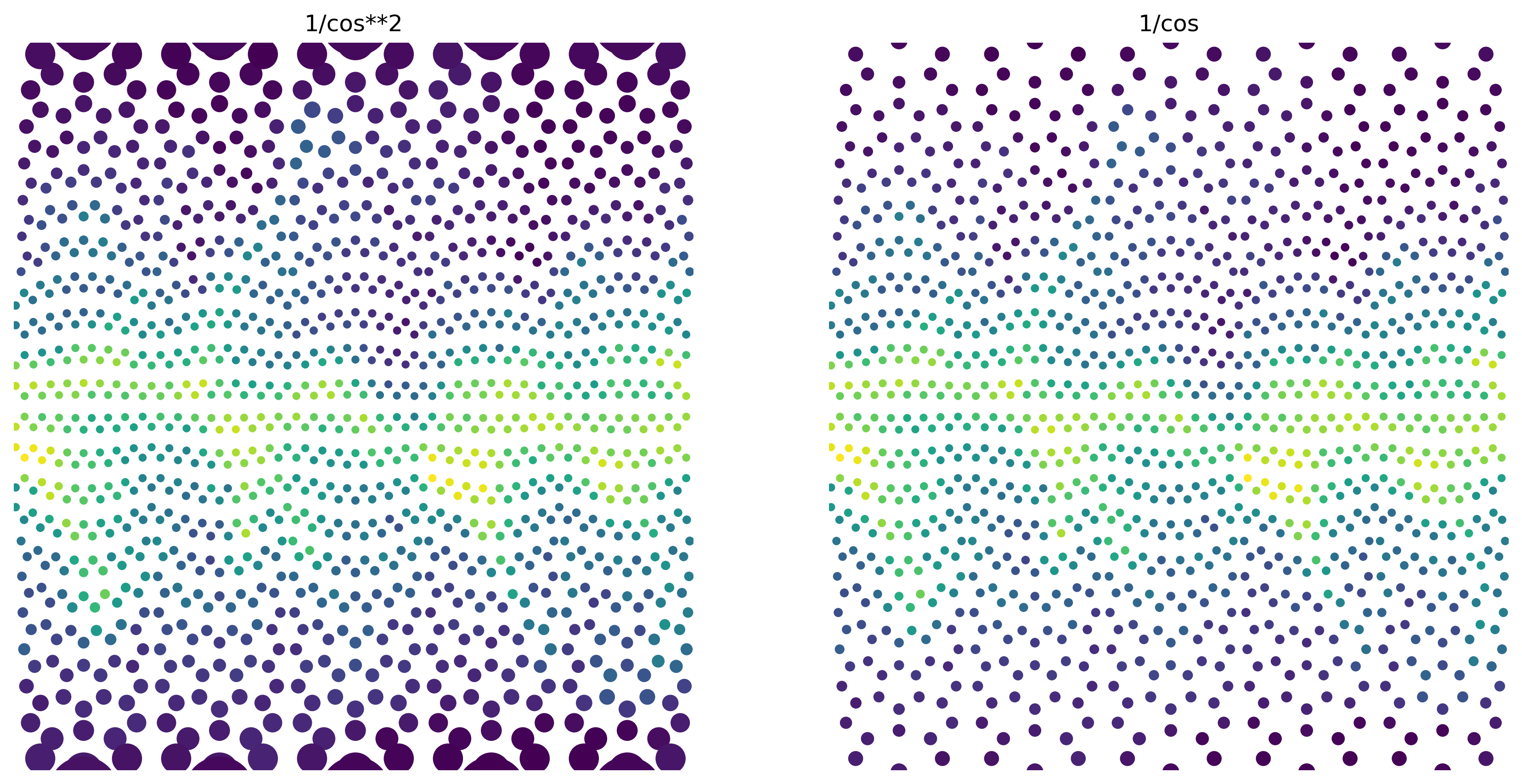
scatter size trick#
If we increase the size of the scatter dot with latitude, the change in dot size roughly compensates for sample point spacing (this is of course dependent on the chosen projection). To illustrate this, we’ll use a larger scatter point size and coarsen our data even more.
coarsen = 7

fig, (ax1, ax2) = plt.subplots(1, 2, figsize=(14, 7), dpi=300)
ax1.scatter(
    ds.clon[:: 4**coarsen],
    ds.clat[:: 4**coarsen],
    c=a.reshape(-1, 4**coarsen).mean(axis=-1),
    s=10 / (np.cos(ds.clat[:: 4**coarsen] * 0.99) ** 2),
)
ax2.scatter(
    ds.clon[:: 4**coarsen],
    ds.clat[:: 4**coarsen],
    c=a.reshape(-1, 4**coarsen).mean(axis=-1),
    s=10 / (np.cos(ds.clat[:: 4**coarsen] * 0.99)),
)
ax1.set_title("1/cos**2")
ax2.set_title("1/cos")

for ax in (ax1, ax2):
    ax.axis("off")
    ax.set_xlim(-np.pi, np.pi)
    ax.set_ylim(-np.pi * 0.45, np.pi * 0.45)
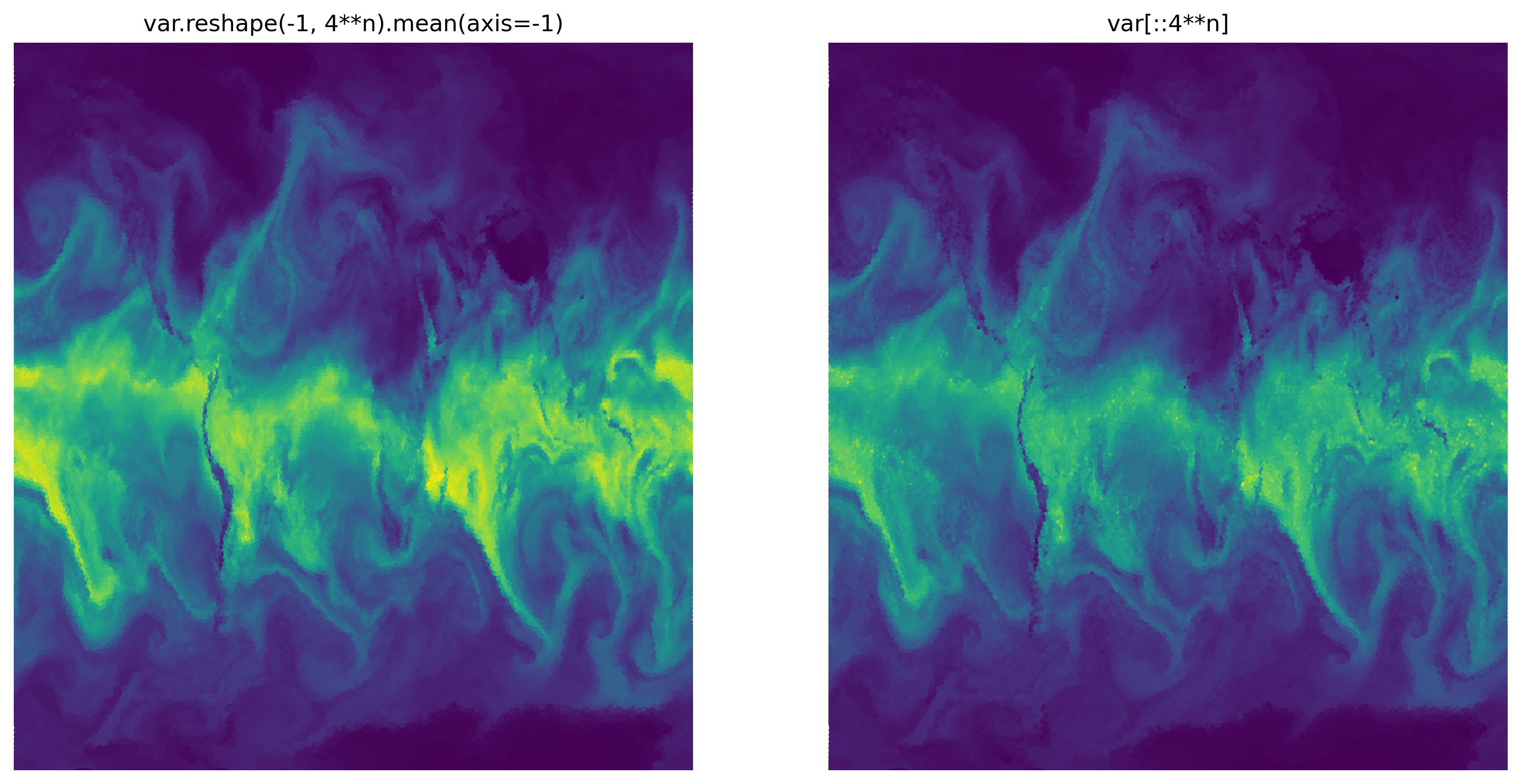
And now, the original plot:
coarsen = 4

fig, (ax1, ax2) = plt.subplots(1, 2, figsize=(14, 7), dpi=300)
ax1.scatter(
    ds.clon[:: 4**coarsen],
    ds.clat[:: 4**coarsen],
    c=a.reshape(-1, 4**coarsen).mean(axis=-1),
    s=1 / (np.cos(ds.clat[:: 4**coarsen] * 0.99) ** 2),
)
ax2.scatter(
    ds.clon[:: 4**coarsen],
    ds.clat[:: 4**coarsen],
    c=a[:: 4**coarsen],
    s=1 / (np.cos(ds.clat[:: 4**coarsen] * 0.99) ** 2),
)
ax1.set_title("var.reshape(-1, 4**n).mean(axis=-1)")
ax2.set_title("var[::4**n]")

for ax in (ax1, ax2):
    ax.axis("off")
    ax.set_xlim(-np.pi, np.pi)
    ax.set_ylim(-np.pi * 0.45, np.pi * 0.45)
subregion#
Another option to reduce the amout of displayed data points is to select a subregion out of the whole domain. If we are interested in a box in latitude / longitude coordinates, the simplest thing to do would be to use a boolean expression as follows:
mask = (
    (ds.clat.values > np.deg2rad(0))
    & (ds.clat.values < np.deg2rad(10))
    & (ds.clon.values > np.deg2rad(-60))
    & (ds.clon.values < np.deg2rad(-50))
)
Now, we’ll plot the subset of the data as above.
plt.scatter(np.rad2deg(ds.clon[mask]), np.rad2deg(ds.clat[mask]), c=a[mask], s=1)
<matplotlib.collections.PathCollection at 0x2b8e816c42e0>
